
Cohort retention analysis groups users by a shared starting point (signup week, first purchase, plan upgrade) and tracks what percentage stays active at each interval afterward. It matters because a single blended retention number hides which specific group is churning and why. Here's what to do in the next 48 hours: define your cohort by acquisition date or activation event, pick one meaningful "returning" event and a consistent time window (weekly or monthly), then plot the results in a cohort table. CustomerGauge's research found a retention lift can grow profits substantially, and a significant share of C-suite executives do not know their company's retention rate or the reasons behind customer churn. That gap is the whole business case for doing this properly.
- Define the cohort: pick an anchor event (signup, activation, first payment).
- Choose the retention event: something meaningful, not just "logged in."
- Build the table: rows as cohorts, columns as time intervals, cells as percent retained.
If the resulting curve looks worse than your gut expects, don't panic and don't rebuild the whole pipeline. Segment the worst cohort by acquisition channel first. That single cut resolves more mysteries than any other move.
Key Takeaways
Cohort retention analysis works because it isolates which specific group of users is churning and why, turning a vague blended metric into a diagnosable, fixable signal.
| Point | Details |
|---|---|
| Pick the right returning event | Use a meaningful action like a completed workflow, not a weak signal like login. |
| Read the curve shape first | Cliffs point to billing issues, slow bleeds point to product-market fit gaps. |
| Rebase to filter tourists | Measure long-term retention from Month 3 instead of Month 0 to isolate the foundational cohort. |
| Pair cohorts with VoC | A 5% retention lift can grow profits significantly; surveys explain the "why" behind the numbers. |
| Consider an outside audit | SaaS LaunchPad's Product Excellence Blueprint diagnoses retention gaps across 21 disciplines when internal bandwidth is short. |
Table of Contents
- What Is Cohort Retention Analysis and Why Does It Matter?
- Which Cohort Type Fits Your Question: Acquisition, Behavioral, or Predictive?
- How Do You Calculate Cohort Retention Rate?
- How Do You Actually Run a Cohort Retention Analysis?
- What Do Different Retention Curve Shapes Actually Mean?
- What Are the Most Common Cohort Analysis Pitfalls?
- How Do You Turn Cohort Findings Into Experiments?
- Which Tool Fits Your Cohort Analysis Needs?
- How Does Voice of the Customer Data Sharpen Cohort Analysis?
- What Does a Real Cohort Table Look Like in Practice?
- How Do You Segment Cohorts Beyond Acquisition and Behavior?
- How Do You Build an Automated Cohort Retention Dashboard?
- Should You Prioritize Long-Term or Short-Term Retention Signals?
- What Do Advanced Cohort SQL Queries Look Like?
- What I've Learned Prioritizing Retention Fixes
- When Should You Bring in Outside Help for a Retention Audit?
- Sources
- FAQ
What Is Cohort Retention Analysis and Why Does It Matter?
Cohort retention analysis answers a question a blended retention rate can't: which specific group of users is sticking, and which one is quietly leaking out the back. A blended rate might tell you "68% retention this month" while masking that users acquired through a paid campaign are churning three times faster than organic signups. Cohort tables let you compare groups at the same point in their lifecycle, so a change in onboarding, pricing, or a feature release shows up as a visible shift between one cohort's curve and the next.
Product and growth teams typically run this analysis to answer four recurring questions:
- Did a specific onboarding change improve or hurt 30-day retention?
- Which acquisition channel produces users who actually stick around?
- Is a new feature increasing engagement, or just adding noise?
- What does current retention behavior imply for 12-month LTV?
Cohort analysis often tells a different story: the campaign cohort's Week 4 retention sits at half the rate of organic signups, dragging down blended LTV even as top-line growth looks strong. Without slicing by cohort, that campaign keeps getting more budget. Cohort work exists precisely to catch that before it compounds.
Which Cohort Type Fits Your Question: Acquisition, Behavioral, or Predictive?
Acquisition cohorts, behavioral cohorts, and predictive cohorts each answer a different operational question, and picking the wrong one wastes a week of analysis on the wrong signal.
Acquisition cohorts group users by when or how they joined, typically signup date or campaign source. They're the default starting point and the best tool for comparing channels or launch periods against each other.
Behavioral cohorts group users by an action they took, not when they joined, like "completed onboarding step 3" or "used the export feature within 7 days." They reveal which in-product behaviors correlate with long-term stickiness, which acquisition cohorts cannot show.
Predictive cohorts use modeled risk scores or propensity signals to group users likely to churn or expand. They're the most operationally useful for triggering interventions but need more mature data infrastructure to build responsibly.
- Acquisition cohorts: best for comparing campaigns and launch timing; weak at explaining why retention differs.
- Behavioral cohorts: best for finding activation milestones; can obscure who those users were before the action.
- Predictive cohorts: best for prioritizing at-risk accounts; require a working model and enough historical data to train it.
Time bucket choice depends on your usage cadence. Daily apps (messaging, fitness tracking) need daily or weekly buckets to catch fast drop-off; monthly-cadence SaaS products (invoicing, reporting tools) need monthly buckets or you'll drown in noise from natural usage gaps. Smaller cohorts (under roughly 100 users) give you fast signal but weak statistical confidence, so pair a small cohort's finding with a directional flag, not a firm conclusion, until volume catches up.
How Do You Calculate Cohort Retention Rate?
The core formula, documented consistently by Amplitude and other analytics platforms, is:
Retention Rate = (Active users in period N ÷ original cohort size) × 100
A cohort of 500 signups in January, with 150 still active by Week 4, gives you a 30% Week 4 retention rate. That single number, tracked across multiple cohorts and intervals, is what fills every cell in a cohort table.
Revenue retention follows a parallel logic but swaps user counts for dollars:
Net Revenue Retention = (Starting MRR + expansion − contraction − churned revenue) ÷ Starting MRR × 100
If a cohort started at $50,000 MRR, gained $6,000 from upsells, lost $2,000 to downgrades, and lost $8,000 to full cancellations, net revenue retention comes out to (50,000 + 6,000 − 2,000 − 8,000) ÷ 50,000 = 92%. Anything above 100% means expansion revenue is outpacing churn inside that cohort, a healthier signal than user-count retention alone.
A few things trip people up on the denominator side:
- Anchor your cohort consistently. Signup-anchored cohorts include users who never activated; activation-anchored cohorts (first meaningful action) tend to show cleaner, more actionable curves.
- Pick the returning event carefully. A login event is often too weak a signal; a completed workflow, a saved report, or a paid renewal tells you far more about real engagement.
- Track churn rate as retention's mirror (Churn Rate = 100 − Retention Rate) so you can report both without doing extra math in a meeting.
How Do You Actually Run a Cohort Retention Analysis?
Running this analysis well comes down to data discipline first, query logic second. Skip the discipline step and every chart downstream is suspect.
Step 1: Confirm your data foundation. You need a persistent user_id that survives login state and device switches, a timestamped cohort-anchor event (signup or activation), a timestamped returning event, and revenue fields if you're tracking monetized retention. Identity resolution across devices and channels is the single most common failure point; a user who logs in from mobile and desktop under two different IDs will look like two churned users instead of one retained one.

Step 2: Run your quality checks. Harmonize timezones before bucketing by day or week, since a user active at 11:45 PM UTC can land in the wrong cohort week entirely. Deduplicate events (a page refresh firing the same "active" event twice) before you count anyone as retained. Confirm your data warehouse retains history long enough to support the lookback window you're planning; a 12-month cohort analysis is useless if raw event data only goes back 90 days.
Step 3: Extract the cohort table. Here's a simplified structure for an acquisition-anchored monthly cohort query:
WITH cohorts AS (
  SELECT user_id, DATE_TRUNC('month', signup_date) AS cohort_month
  FROM users
),
activity AS (
  SELECT user_id, DATE_TRUNC('month', event_date) AS active_month
  FROM events
  WHERE event_name = 'completed_core_workflow'
)
SELECT
  c.cohort_month,
  DATE_DIFF('month', c.cohort_month, a.active_month) AS month_number,
  COUNT(DISTINCT a.user_id) AS active_users
FROM cohorts c
JOIN activity a ON c.user_id = a.user_id
GROUP BY 1, 2
ORDER BY 1, 2;
Divide active_users by each cohort's original signup count and you have your retention percentage per cell. For "did not do" logic, such as isolating users who signed up but never completed onboarding, add a LEFT JOIN with a WHERE a.user_id IS NULL clause instead of the inner join above.
Step 4: Build the table template. Rows represent cohort start periods (Jan, Feb, Mar signups). Columns represent time since the anchor event (Month 0, Month 1, Month 2). Each cell holds the percentage of that row's original cohort still active by that column's interval.
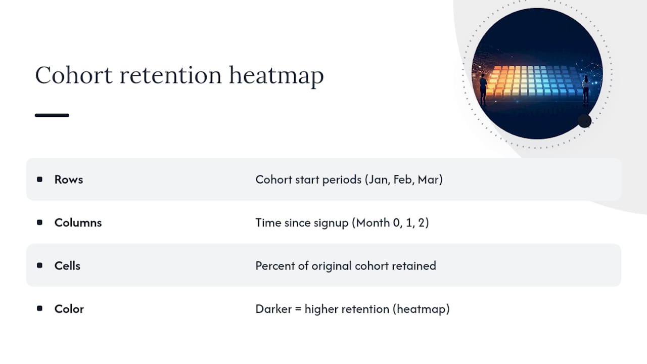
Step 5: Automate it. Schedule the query to run weekly or monthly depending on your product's usage cadence, write outputs to a table in your warehouse, and visualize as a heatmap where darker shading marks stronger retention. Warehouse-native queries also support the multi-criteria and "did not do" logic that off-the-shelf dashboards often can't handle at scale.
Pro Tip: Build your first cohort table by hand in a spreadsheet before automating anything. You'll catch identity-resolution bugs and timezone errors in ten minutes that would otherwise corrupt a month of automated reports.
What Do Different Retention Curve Shapes Actually Mean?
Cohort analysis typically produces a handful of recognizable curve shapes, and the shape tells you more than the raw percentage ever will.
Perpetual decline is a curve that never levels off; retention keeps dropping toward zero across every interval you measure. This usually signals a product that hasn't found lasting value for its users, not a fixable onboarding tweak.
Flatten-and-hold shows a sharp initial drop followed by a stable plateau, often somewhere between Month 2 and Month 3. This is the healthiest common shape. It usually means you've found your foundational cohort, the users who genuinely need the product, and everyone above that plateau line was a trial run that didn't fit.
Cliffs are sudden, sharp drops at a specific interval, often tied to a billing event, trial expiration, or contract renewal date. A cliff at Month 1 almost always means a free trial is ending; a cliff at Month 12 usually means annual contracts are lapsing.
Smile or bump curves show retention dipping and then rising again later. This unusual pattern often points to a seasonal product or a feature that takes time to click, users leave, then come back once a specific need resurfaces.
Once you've identified the shape, the next move is to slice the offending cohort by a second dimension:
- Acquisition channel (paid vs. organic vs. referral)
- Onboarding milestone completion (did they hit activation within 7 days?)
- Plan tier (free vs. paid, or specific pricing tiers)
- Device or platform (mobile app vs. web)
- Region or market (timezone-driven usage patterns, localization gaps)
A cliff at Month 1 paired with a plan-tier slice showing it's concentrated entirely in free-trial users points straight at trial-to-paid conversion friction, not a product problem. A slow bleed across every acquisition channel evenly points at something more structural, and probably calls for an A/B test on onboarding rather than a billing fix.
What Are the Most Common Cohort Analysis Pitfalls?
Bad cohort analysis is worse than no cohort analysis, because it produces false confidence. A few checks catch most of the damage before it reaches a roadmap decision.
- Identity resolution gaps count one real user as two, inflating apparent churn.
- Undeduplicated events inflate activity counts and make retention look better than it is.
- Timezone mismatches shove users into the wrong cohort week or month.
- Sample sizes under roughly 100 users produce curves that swing wildly from noise, not signal.
- Tourist churn, including a growing wave of AI-agent and bot signups sometimes called "AI tourists," inflates Month 0 cohort size with users who were never going to stick around regardless of product quality.
Rebasing retention to a post-tourist anchor, like Month 3 instead of Month 0, filters out that noise and isolates what practitioners call the foundational cohort, the users who actually needed the product. Watch for correlation dressed up as causation too: a cohort that retains better after a redesign might just be a higher-intent acquisition batch that would have retained well regardless.
Pro Tip: Before attributing any retention shift to a product change, check whether the acquisition mix shifted in the same window. A cleaner paid-traffic filter can look identical to a UX win on a chart.
How Do You Turn Cohort Findings Into Experiments?
A cohort insight only earns its keep once it drives a test with a measurable outcome. Here's the sequence that works:
- Write a specific hypothesis. Not "improve onboarding," but "adding a guided setup checklist increases Week 2 retention for self-serve signups by at least 5 percentage points."
- Select test and control cohorts. Split by a clean, non-overlapping rule (signup date, random assignment, or account ID hash) so no user contaminates both groups.
- Size the sample. Use your historical cohort variance to estimate how many signups you need before a 5-point retention difference is statistically distinguishable from noise.
- Set the measurement window. Match it to your typical retention curve shape. If most churn happens by Week 4, don't wait until Month 3 to call the test.
- Guard against cross-contamination. Watch for shared accounts, referral loops, or marketing emails that leak the treatment into your control group.
- Report delta-retention, not just uplift. Track the percentage-point difference at your target interval, the relative uplift percent, and, where possible, revenue-at-risk recovered.
- Estimate ROI against intervention cost. A checklist feature that costs two engineering weeks and recovers $40,000 in annual revenue-at-risk is an easy call; a full onboarding rebuild needs a bigger number to justify it.
Sequence quick wins (copy tweaks, checklist nudges, email timing) ahead of structural fixes (pricing model changes, core workflow redesigns) since the fast wins buy credibility and data for the bigger bets. A practical operating cadence runs weekly checks on surface signals, monthly KPI reviews, and a deeper quarterly cohort and segmentation pass, which keeps the team from either ignoring retention or drowning in it.
Which Tool Fits Your Cohort Analysis Needs?
Amplitude, Mixpanel, and Userpilot each approach cohort work from a different angle, and the right pick depends on your team's technical depth and product stage.
Amplitude documents the standard retention formula directly in its platform and leans toward teams that want built-in behavioral cohort logic without writing SQL for every question. Mixpanel offers strong table and heatmap visualizations alongside more flexible multi-criteria cohort building, including "did not do" logic for isolating drop-off causes. Userpilot focuses specifically on onboarding-stage retention and product-led growth teams that need to tie cohort behavior to in-app guidance and messaging.
- Best for fast behavioral cohort setup without a data team: Amplitude or Mixpanel.
- Best for onboarding-specific retention and PLG motion tracking: Userpilot.
- Best for custom, high-volume, or long-lookback cohort logic: a warehouse-native SQL stack.
| Best for | Cohort flexibility | Data integrations | Retention metrics | Visualization | SQL access | Pricing/scale |
|---|---|---|---|---|---|---|
| Behavioral cohorts, general analytics | Acquisition, behavioral, multi-criteria | Broad event/warehouse integrations | User retention, revenue retention | Tables, heatmaps | Query-based cohort builder | Scales from startup to enterprise |
| Onboarding and PLG-focused retention | Acquisition, behavioral, in-app triggers | Product analytics integrations | User retention, activation metrics | In-app dashboards | Limited native SQL | Best fit at earlier product-led stages |
| Custom, high-volume analysis | Full custom logic, rolling and event-based cohorts | Direct warehouse connection | Any metric definable in SQL | Custom BI dashboards | Full SQL access | Scales to enterprise data volume |
Warehouse-native stacks trade setup speed for total flexibility. If your product needs rolling cohorts, long lookback windows, or logic no dashboard vendor has built yet, pushing the analysis into SQL against your own warehouse is usually the better long-term investment, even though it costs more engineering time upfront.
How Does Voice of the Customer Data Sharpen Cohort Analysis?
Retention rate tells you what happened. Voice of the Customer (VoC) feedback tells you why, and pairing the two turns a backward-looking metric into a genuinely predictive one. A cohort showing early decline is a symptom; a targeted survey run at the right moment names the disease.

CustomerGauge's research found a 5% improvement in retention can lift profits by as much as 85%, and yet 44% of C-suite executives surveyed didn't know their own retention rate or the reasons behind their churn. That gap between measurement and understanding is exactly where VoC closes the loop.
Time a short survey to fire right when a cohort crosses a risk threshold, not months later:
- Why did you stop using [specific feature] after your first week?
- What almost made you cancel your account this month?
- On a scale of 0 to 10, how likely are you to recommend this to a colleague, and why?
- What would have made your first 30 days easier?
That 15-point gap represents roughly $12,000 in monthly revenue at risk for that cohort alone. A quick survey to the still-active accounts in that cohort revealing repeated complaints about a specific integration failure turns an abstract number into a two-week engineering fix with a clear payoff.
Pro Tip: Send the survey in-app immediately after the risk-triggering event, not as a separate email days later. Response rates drop sharply once the moment of friction has passed, and feeding results straight into an at-risk alert queue keeps VoC data from sitting unused in a spreadsheet.
What Does a Real Cohort Table Look Like in Practice?
Here's a simplified acquisition-anchored cohort table tracking four monthly signup groups across six intervals, using a "completed core workflow" event as the retention signal:
Mini-playbook: Hypothesize that April's steeper drop ties to a pricing change rolled out that month. Test by comparing April's retention against a control group of similar-sized accounts who signed up under the old pricing in a parallel channel. Expect the metric to move within four to six weeks if pricing is the cause; if the gap persists after correcting pricing, look at onboarding changes shipped the same month instead.
At larger scale, this same table structure runs as a scheduled SQL job feeding a BI dashboard, with the manual interpretation step above turned into an automated alert whenever a new cohort's Month 1 or Month 2 number deviates more than a set threshold from the trailing three-cohort average.
How Do You Segment Cohorts Beyond Acquisition and Behavior?
Acquisition and behavioral cohorts are the starting point, but demographic and technographic slices often surface the sharper insight. Segmenting by company size, industry vertical, job role, device type, or tech stack turns a flat retention curve into a set of distinct stories.
That single demographic cut can redirect an entire quarter's roadmap.
Technographic segmentation groups users by the tools they already use: CRM platform, existing tech stack, integration usage, or API adoption. A product that integrates with a specific CRM might show meaningfully higher retention among accounts using that CRM, a signal worth building deeper integration around rather than a generic feature request.
Demographic segmentation covers company size, industry, geography, and job title. Job title in particular matters more than most teams assume: a tool adopted by an operations lead often retains differently than the same tool adopted by a marketing generalist, even inside the same company size band.
Practical segmentation approach:
- Start with the demographic or technographic field you already collect at signup (industry, company size, integration selected).
- Cross it against your existing behavioral cohort, don't replace one with the other.
- Look for a segment where retention diverges by 15 percentage points or more from the blended average; that's your signal worth acting on.
- Avoid segmenting into cells so small the sample size makes the percentage meaningless.
The goal isn't more cohorts for their own sake. It's finding the one cut that actually explains the divergence your acquisition and behavioral cohorts couldn't.
How Do You Build an Automated Cohort Retention Dashboard?
A dashboard that updates itself beats a manual monthly spreadsheet exercise every time, mostly because it catches problems the week they start instead of the month someone finally builds the report.
Step 1: Centralize your event data. Every retention calculation depends on clean, timestamped events sitting in one place, usually a warehouse like Snowflake, BigQuery, or Redshift, fed by your product analytics pipeline.
Step 2: Write the cohort query once, parameterize it. Build the SQL cohort extraction (like the query shown earlier) with the cohort anchor event, returning event, and time bucket size as variables, so the same query serves weekly, monthly, or custom-window reporting without rewriting logic each time.
Step 3: Schedule the job. Most warehouses support native scheduling (dbt jobs, warehouse-native schedulers, or an orchestration tool) to run the cohort query daily or weekly and write results to a dedicated retention table.
Step 4: Connect a visualization layer. Point a BI tool at that retention table and build a heatmap view, darker cells for stronger retention, so a new cohort's shape is visible at a glance without reading raw numbers.
Step 5: Set threshold alerts. Configure an alert that fires when a new cohort's Month 1 retention drops more than a defined percentage below the trailing average of the last three cohorts. This is the difference between finding a problem in week one versus discovering it in a quarterly review.
Step 6: Review and prune. Revisit which cohort cuts the dashboard actually gets used monthly and retire the ones nobody checks. A dashboard with forty tabs gets ignored; one with five gets used every Monday.
Should You Prioritize Long-Term or Short-Term Retention Signals?
Short-term retention (Week 1 to Week 4) mostly measures onboarding quality and initial product fit. It's the fastest signal to get and the fastest to act on, but it's also the noisiest, easily swayed by a single marketing campaign or seasonal spike in signups.
Long-term retention (Month 6 to Month 12 and beyond) measures whether the product delivers durable value once the novelty wears off. It's the number that actually correlates with net revenue retention and long-term company health, but it takes months to accumulate and reacts slowly to any single fix you ship.
The practical implication: use short-term curves to run fast, iterative onboarding experiments, since you'll see results within weeks. Use long-term curves to validate whether your product strategy itself is sound, not just your activation flow. Measuring long-term retention from a post-tourist anchor like Month 3, rather than Month 0, tends to produce a cleaner read on genuine product-market fit, since it strips out signups who were never going to become real users regardless of anything you build.
A team obsessing exclusively over Week 1 numbers can optimize onboarding into a local maximum, a slicker signup flow that lifts short-term retention while doing nothing for the 12-month number that actually drives revenue. Check both cadences on a regular schedule, and treat a long-term dip as the more serious flag, even when the short-term chart looks fine.
What Do Advanced Cohort SQL Queries Look Like?
Basic acquisition cohorts cover most questions, but two patterns come up often enough in mature retention work to warrant their own query structure: rolling cohorts and event-based cohorts.
A rolling cohort query measures retention relative to a moving window instead of a fixed calendar month, useful for products with continuous, non-seasonal signup patterns:
WITH activity AS (
  SELECT user_id, event_date,
    DATE_DIFF('day', first_active_date, event_date) AS days_since_start
  FROM events
  JOIN (
    SELECT user_id, MIN(event_date) AS first_active_date
    FROM events
    GROUP BY user_id
  ) first_dates USING (user_id)
)
SELECT
  days_since_start,
  COUNT(DISTINCT user_id) AS active_users
FROM activity
WHERE days_since_start IN (0, 7, 14, 30, 60, 90)
GROUP BY days_since_start
ORDER BY days_since_start;
An event-based cohort groups users by a specific behavioral trigger rather than signup date, useful for isolating the impact of one feature launch:
WITH feature_users AS (
  SELECT DISTINCT user_id, MIN(event_date) AS first_use_date
  FROM events
  WHERE event_name = 'used_new_feature'
  GROUP BY user_id
)
SELECT
  DATE_DIFF('week', f.first_use_date, e.event_date) AS week_number,
  COUNT(DISTINCT e.user_id) AS retained_users
FROM feature_users f
JOIN events e ON f.user_id = e.user_id
  AND e.event_date >= f.first_use_date
GROUP BY week_number
ORDER BY week_number;
Both patterns push more logic into the warehouse than a standard dashboard tool typically allows, which is exactly why teams running rolling or event-based cohorts tend to graduate toward SQL-first stacks as their questions get more specific.
What I've Learned Prioritizing Retention Fixes
Most teams chase the wrong fix first. They see a slow bleed and rebuild the whole onboarding flow when the real leak is one broken activation event nobody instrumented correctly. The fastest gains almost always come from three places: fixing activation (the single moment a user gets real value), removing hard cliffs (billing surprises, trial-expiration confusion), and instrumenting behavioral events well enough to trust the data in the first place.
Priority order that tends to work:
- Fix activation before touching retention curves further out. Nothing downstream matters if users never reach first value.
- Remove cliffs before chasing slow bleeds. A cliff is a specific, fixable event; a bleed often needs deeper product work.
- Instrument before you optimize. Bad data produces confident, wrong conclusions faster than no data does.
One caution: don't let cohort analysis become a substitute for shipping. Teams can spend a quarter perfecting segmentation cuts while the obvious fix, a broken onboarding email, sits unshipped. Run one clean experiment at a time, measure it against the interval you defined upfront, and move to the next one.
When Should You Bring in Outside Help for a Retention Audit?
Running cohort analysis well takes clean data, the right SQL skills, and enough spare bandwidth to act on what you find, three things a lot of growth teams are short on at the same time. If your instrumentation has gaps, your team lacks a data analyst, or you need a fast, structured read on where retention is actually leaking before your next planning cycle, an outside audit closes that gap faster than building the capability from scratch.
When evaluating any outside product-analysis service, check for four things: concrete deliverables (not just a slide deck), proof points from real client work, sample outputs you can review before buying, and a pricing model that doesn't lock you into a long-term contract for a one-time need.
SaaS LaunchPad runs a 21-discipline Product Excellence Blueprint that covers retention analysis alongside onboarding, monetization, and scalability review, then delivers a Master Transformation Prompt you can hand directly to your engineering team. It's pay-per-analysis, so you buy a credit for the audit you need instead of committing to a subscription. If your cohort curves are showing a problem you can't diagnose in-house fast enough, check the credit pricing and get a full analysis started.
Sources
- Cohort analysis in 2026: How to read the chart, choose a platform, and turn retention into growth | Mixpanel Blog
- Cohort analysis for businesses: Here's what to know | Stripe
- How to Do a Customer Retention Analysis (Using VoC Feedback) | CustomerGauge
FAQ
What Is an Example of Cohort Analysis?
A SaaS company groups all users who signed up in January into one cohort, then tracks what percentage remain active each month after signup. Comparing that curve against the February and March cohorts shows whether a product change made in February improved or hurt retention.
What Is the Cohort Analysis Method?
The method groups customers by a shared starting event, like signup date or first purchase, then measures a defined activity metric at fixed intervals afterward. Stripe describes three core types: acquisition, behavioral, and predictive cohorts, each suited to a different business question.
How Do You Calculate Cohort Retention?
Divide the number of users still active in a given period by the original cohort size, then multiply by 100. A cohort of 500 signups with 150 active at Week 4 gives a 30% Week 4 retention rate, the same formula documented by Amplitude.
What Does a Cohort Analysis Tell You?
It tells you which specific groups of users are retaining well or poorly, and it links that difference to a cause, like an onboarding change, a campaign source, or a pricing shift. A blended retention number can't do either of those things.
How Does SaaS LaunchPad Help With Retention Analysis?
SaaS LaunchPad's 21-discipline audit includes retention and engagement analysis alongside onboarding, monetization, and scalability review, delivering a Product Excellence Blueprint and a ready-to-use Master Transformation Prompt for teams that need a fast, structured diagnosis.